
You are using an out of date browser. It may not display this or other websites correctly.
You should upgrade or use an alternative browser.
You should upgrade or use an alternative browser.


")

I'm with Joe here; lower the blue a bit so it's dark at the start then as it continues it dries out a bit so it matches both Graphics and Helper :^)I would use blue ones, fits your Graphics and Helper tags nicely")
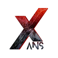
Since I am a fan of more powerful colors I prefer the red one.
The blue one looks nice as well, but since the backround is white, the logo itself looks
too "cold" in my opinion.
Both of them are lit tho
May i ask what texture you used for the "X" ?
The blue one looks nice as well, but since the backround is white, the logo itself looks
too "cold" in my opinion.
Both of them are lit tho
May i ask what texture you used for the "X" ?
Since I am a fan of more powerful colors I prefer the red one.
The blue one looks nice as well, but since the backround is white, the logo itself looks
too "cold" in my opinion.
Both of them are lit tho
May i ask what texture you used for the "X" ?
The texture comes from some high quality photos taken of the Moon. But you can just google search "Moon Texture" and it should be almost the same, but to make this effect on text I used blending options and a lot of bevel and emboss settings!
Similar threads
- Replies
- 10
- Views
- 2K